
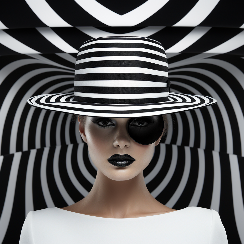
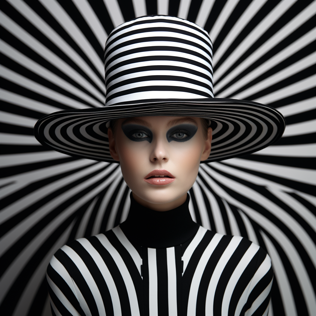
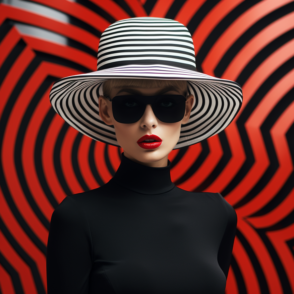
What it does:
Afterimages & moiré: colors you think you see, ripples that aren’t there.
Vibration & flicker: high-contrast stripes and checks create shimmer.
Illusory depth: flat grids bulge, warp, or tunnel.
Figure/ground games: your brain keeps swapping what’s foreground.
Hallmarks
Machine-clean surfaces; math meets perception science (Gestalt/psychophysics).
Razor-precise repetition (lines, grids, concentric circles).
Black-and-white dazzle or calculated color interactions.
Where it lands in history:
Late 1950s–60s, spotlighted by MoMA’s The Responsive Eye (1965).
Key names: Bridget Riley, Victor Vasarely, Jesús Rafael Soto, Carlos Cruz-Diez, Richard Anuszkiewicz (with Josef Albers as color-guru ancestor).

Op vs. Pop (quick compass)
You can hybridize, but Op’s first loyalty is to perception.
Op: pattern is the subject; the thrill is optical.
Pop: culture is the subject; the image quotes media/brands.
Op art emerged in the 1960s, primarily in Europe and the United States. It’s a movement focused on optical illusions and visual perception. Artists wanted to create a sense of movement, depth, or vibration through static imagery, and they succeeded using geometric shapes, patterns, and precise color contrast.
-https://www.abirpothi.com/exploring-op-art-characteristics-techniques-and-influential-artists-part-2/
Here is a biography on one of the premier Op Artists, Bridget Riley
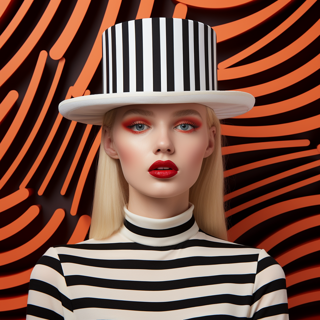
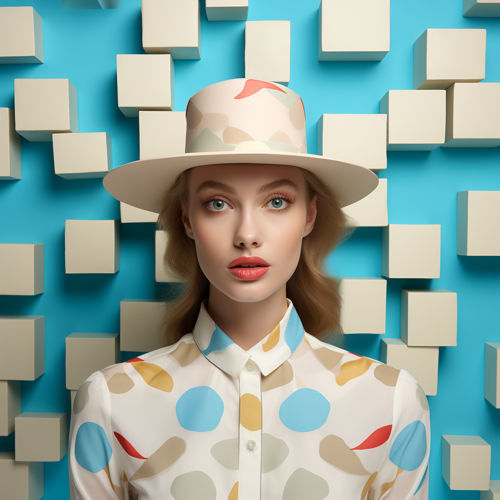
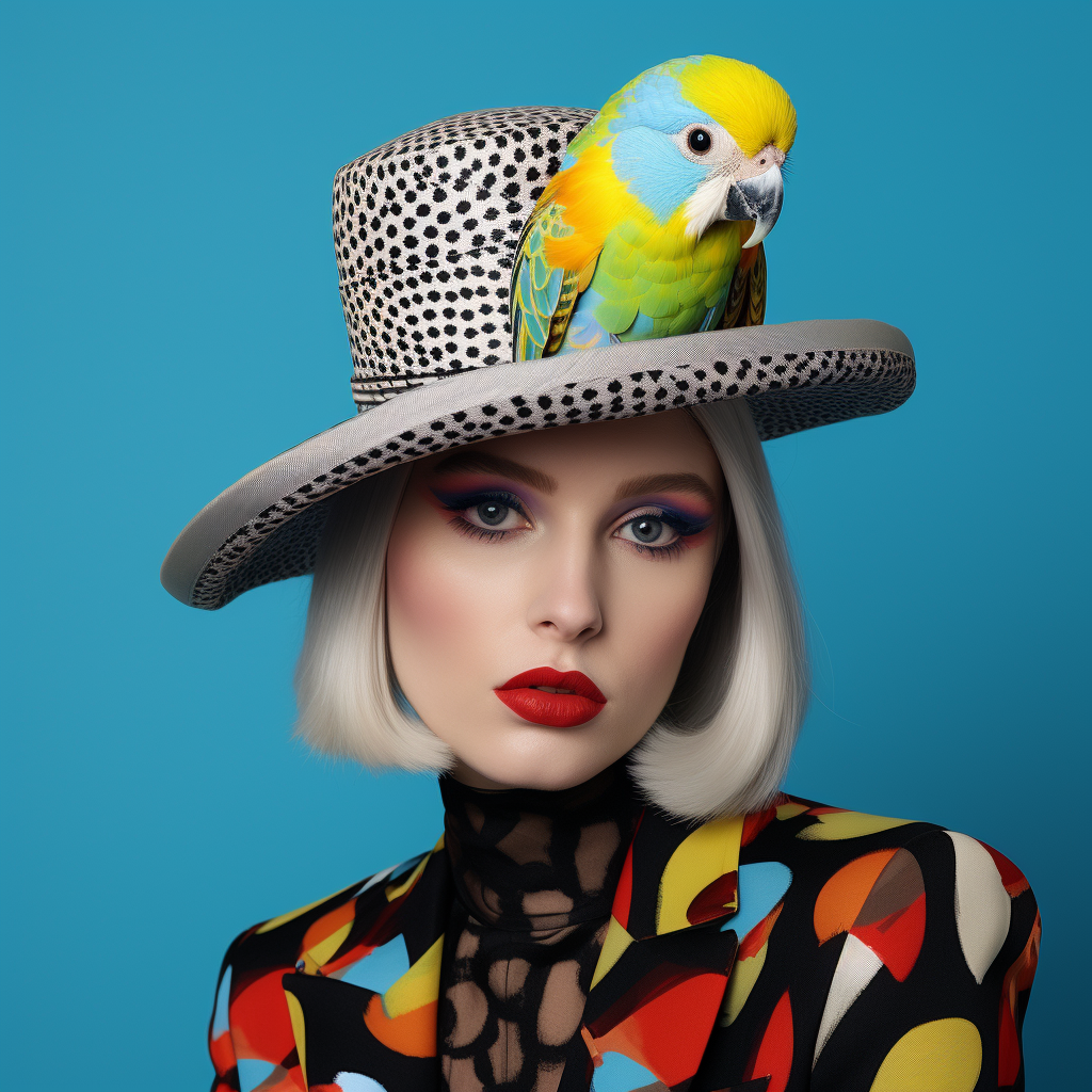
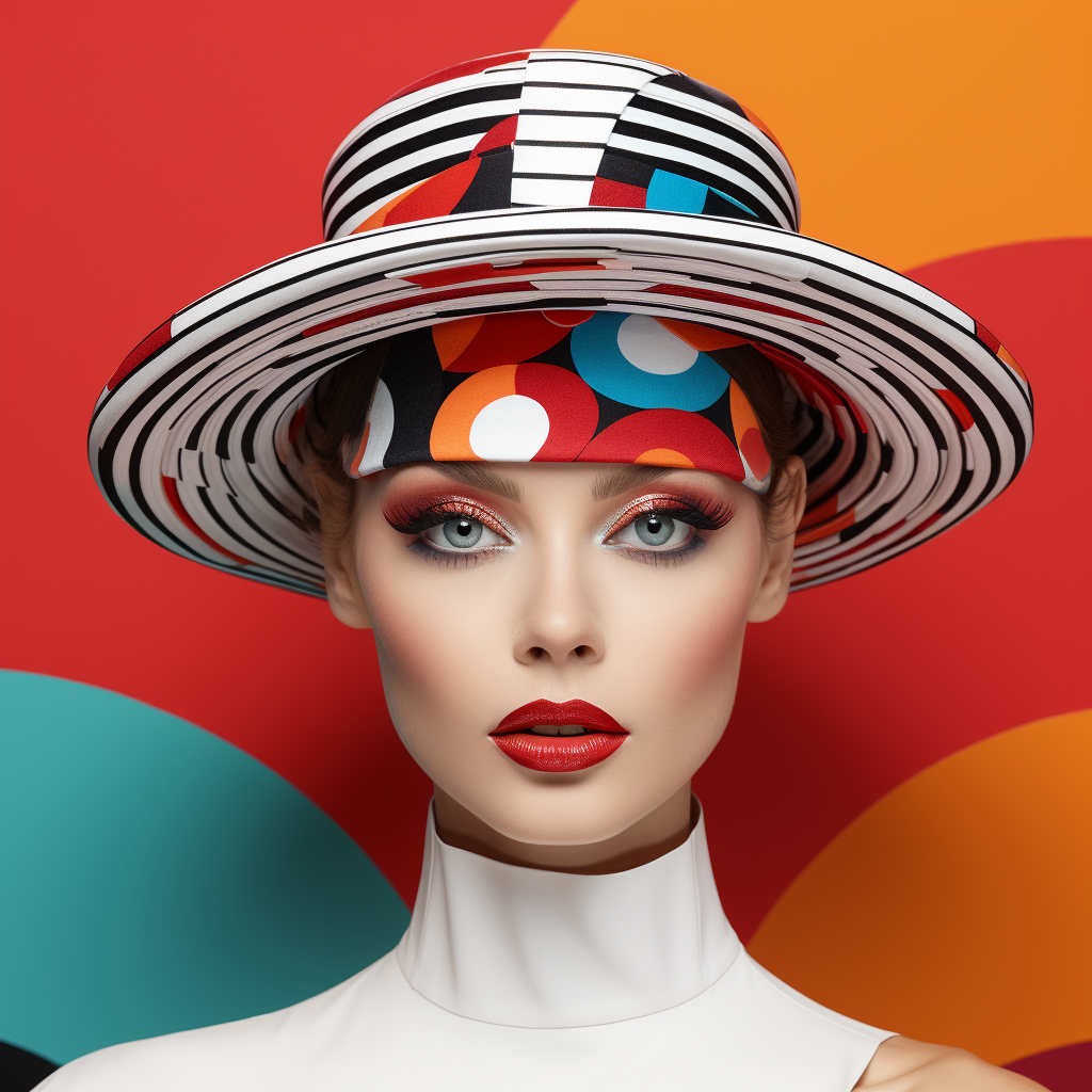
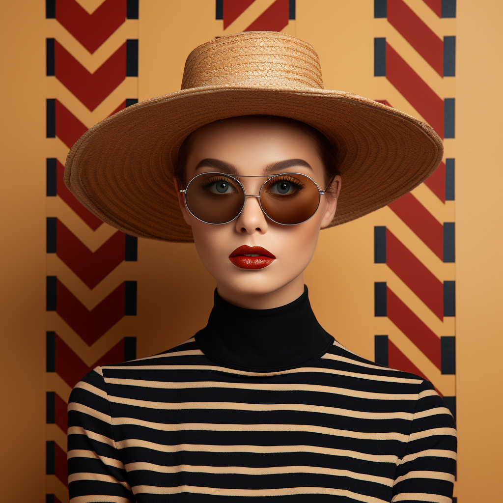
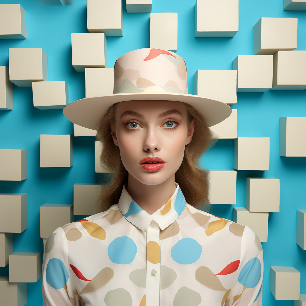
These Op Art style renderings done in Midjourney6